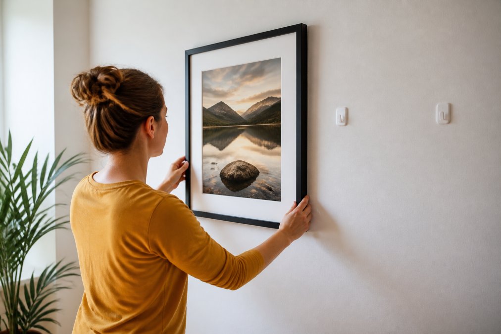
 listicle
7 Best Wall Art Trends 2026 to Transform Your Space
Last Updated: October 28, 2026
Quick Summary
The best wall art trends in 2026 lean toward texture, scale, and calm, with tactile surfaces, oversized nature photography, and warm neutral palettes leading the way. These wall art trends favor fewer, bolder pieces over dense arrangements, so one large statement does most of the styling work.
- Oversized canvas should cover roughly two-thirds to three-quarters of the furniture width below it.
- Hang a gallery wall's center about 57 to 60 inches from the floor, measuring from the group's center.
- Keep 2 to 3 inches between frames for a tight look, or 4 to 6 inches for a looser feel.
- Choose matte surfaces in bright rooms, since glossy finishes under direct sunlight wash out texture.
- Modern gallery walls favor three to five pieces in a loose arrangement over dense grids of small frames.
Table of Contents
- Wall Art Trends 2026: What's Shaping Interiors This Year
- Oversized Wall Art and Large Canvas Statements
- Nature Photography Wall Art and Biophilic Design
- Textured Artwork and Tactile Surfaces
- Warm Minimalism and Quiet Luxury Palettes
- Gallery Wall Ideas for Modern Homes
- How to Curate a Gallery Wall That Feels Personal
- Choosing Fine Art Prints for Your 2026 Refresh
- Frequently Asked Questions
Wall Art Trends 2026: What's Shaping Interiors This Year
The best wall art trends in 2026 lean toward texture, scale, and calm. Tactile surfaces, oversized nature photography, and warm neutral palettes are among the directions discussed in wall art trend coverage this year.
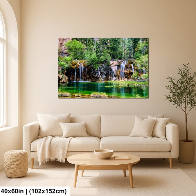
Here's the tension worth naming early: the biggest wall art trends of 2026 all push toward restraint, yet the pieces themselves are bolder and larger than ever. Fewer artworks, bigger statements.
Below, we break down seven directions, plus sizing, placement, and budget guidance.
Oversized Wall Art and Large Canvas Statements
A common mistake is buying a canvas that's too small for the wall. A large canvas should cover roughly two-thirds to three-quarters of the width of the furniture below it. Above a sofa, measure the wall and the sofa before shopping.
For a deeper walkthrough on scale and format, see our guide on how to buy large scale nature photography prints.
Nature Photography Wall Art and Biophilic Design
Nature photography wall art brings the outdoors inside through landscape, botanical, and wildlife imagery.
The appeal is simple. A landscape photograph gives a windowless room a horizon. A close-up botanical print adds organic detail without a living plant's upkeep.
Best for: bedrooms, home offices, and any room with limited natural light. Skip if: your space already has heavy pattern; a busy print on busy walls fights itself.
Textured Artwork and Tactile Surfaces
Textured artwork is wall art with visible surface depth, from dimensional mixed-media pieces to prints that read as tactile. Urban Road identifies textured, tactile artworks as a 2026 trend, and Printful also lists mixed-media and textured surfaces among its wall-art styles for the year.
Here's where most guides get vague. Texture doesn't have to mean a heavy three-dimensional object. A matte print surface can add tactile interest. If you're drawn to frame-free displays, our roundup of nature photography without frames covers seven display options.
The four texture formats, ranked by effort
- Dimensional mixed media (highest effort). Plaster, resin, or sculpted elements cast real shadows. These pieces are heavy, usually need two anchors or a French cleat, and collect dust in the recesses. Best on a wall you won't touch or move furniture against.
- Canvas with visible brush or weave texture. The weave catches light and reads as depth from across a room. Lighter than mixed media and easier to hang with a single D-ring pair.
- Matte fine art paper with a deckled or cotton-rag surface. The texture is subtle up close but adds warmth without glare. The most renter-friendly option because it's light and frame-swappable.
- Textured wallpaper or a textured backing panel behind a flat print. You get tactile interest at the wall level while keeping the artwork itself flat and easy to change.
Room-by-room fit
- Hallway and dining room: texture shines here because these walls are seen at an angle and in motion. A single dimensional piece at eye level beats a flat print that disappears in passing.
- Bedroom: keep texture soft and matte. Heavy dimensional pieces above a headboard are a hazard if they work loose; a textured canvas or rag-paper print is the safer call.
- Home office: texture behind a video-call backdrop adds depth on camera without the glare a glossy print throws under a ring light.
- Small spaces: one textured piece reads as a focal point; several compete and make a tight room feel cluttered.
Lighting and care
Watch out: glossy finishes under direct sunlight create glare that washes out texture entirely. Choose matte surfaces in bright rooms, and angle a picture light across, not straight down onto, a textured piece so the raking light picks up the surface instead of flattening it. Keep textured art out of humid rooms like bathrooms unless the piece is sealed; plaster and unsealed canvas can warp or grow mildew.
Buying trade-offs
Textured originals and mixed-media pieces carry the highest price and the most care; canvas sits in the middle; matte rag-paper prints are the most affordable and the easiest to swap as trends move. If you want the look without the commitment, start with a matte print and add a dimensional piece once you know the wall works.
Warm Minimalism and Quiet Luxury Palettes
Warm minimalism is a restrained design style built on neutral, earthy tones rather than stark white and gray. Quiet luxury follows the same logic: fewer pieces, better materials, softer color.
The palette works because it lets one artwork carry the room. If you're styling a compact, pared-back space, our guide to choosing wall art for modern apartments walks through the specifics.
Best for: small rooms, rental units, and anyone who redecorates often. Skip if: you want color to be the focal point; this palette deliberately recedes.
Gallery Wall Ideas for Modern Homes
Gallery wall ideas for 2026 favor fewer, larger pieces over dense grids of small frames. A modern gallery wall is a curated display, not a filled rectangle. Three to five pieces in a loose arrangement reads more current than nine frames in perfect symmetry.
Two layouts worth trying:
- The anchor row: one oversized piece with two smaller prints aligned beneath it.
- The staggered column: three vertically stacked prints of varying heights in a narrow wall.
Keep a consistent frame finish and let subject matter vary. Our detailed guide on how to curate a gallery wall covers spacing, layout templates, and hanging heights in full.
Do the math before you shop
A common guideline is to hang the center of a gallery wall at about 57 to 60 inches from the floor, roughly eye level for an average adult, and measure from the center of the group, not the top frame.
Spacing: 2 to 3 inches between frames for a tight, intentional look; 4 to 6 inches if you want a looser, more modern feel. Pick one and repeat it, inconsistent gaps are what make a gallery wall look accidental.
The template method (no extra holes)
Cut paper templates to the exact size of each frame and tape them to the wall with painter's tape. Step back from across the room and from the doorway. Adjust on paper, not drywall. Once you're happy, mark the hanging point on each template, install hardware, and pull the paper down.
Budget tiers
- Entry: matching ready-made frames with inexpensive prints. The risk is a wall that reads as store-bought; vary subject matter and mix one larger piece in.
- Mid: a mix of framed prints and one canvas, with a consistent frame finish tying them together.
- Higher: one original or limited-edition anchor piece surrounded by prints, which gives the wall a focal point and a story.
Room-by-room notes
- Stairwell: follow the pitch of the stairs with the bottom edge of the frames, and keep the group centered on the run of wall you see from the bottom step.
- Dining room: a horizontal anchor row above a sideboard or buffet, sized to the furniture width.
- Home office: a small three-piece column behind the desk reads well on video calls without dominating the frame.
- Hallway: a staggered column in a narrow space; keep frames shallow so they don't intrude on foot traffic.
If you're mixing trend-led pieces with personal photography, heirlooms, or travel prints, let one anchor piece set the palette and repeat one of its colors through the supporting frames. That's what keeps a gallery wall from feeling generic.
How to Curate a Gallery Wall That Feels Personal
Curating a gallery wall means choosing pieces that share a thread, whether subject, palette, or place, rather than matching frames. Start with one piece you love, then build outward.
A simple method we recommend:
- Pick an anchor artwork and note its dominant two colors.
- Choose supporting prints that repeat one of those colors.
- Vary size, not style, to keep it cohesive.
- Lay everything on the floor before touching a nail.
- Keep 5-8 cm between frames for a tight, intentional look.
The personal part comes from subject matter. Travel photography from places you've actually been can make a gallery wall feel personal.
Choosing Fine Art Prints for Your 2026 Refresh
When choosing fine art prints, consider subject fit and how the piece will look in your space. LarryCoulsonPhoto specializes in landscape, cityscape, nature, travel, and abstract photography, which covers most of the directions above in one catalog.
Before you commit, confirm the print will actually look right on your wall. Our guide on visualizing art in your home before buying explains how to preview scale and color accurately.
A quick comparison of the trends and who each suits:
Trend | Best Room | Effort to Style | Watch Out For |
|---|---|---|---|
Oversized statement art | Living room | Low | Undersizing the piece |
Nature and biophilic art | Bedroom, office | Low | Clashing with heavy pattern |
Textured artwork | Hallway, dining | Medium | Glare on glossy finishes |
Warm minimalism | Small rooms, rentals | Low | Palette feeling flat |
Gallery wall | Any open wall | High | Overcrowding frames |
Check the LarryCoulsonPhoto website for current pricing.
Frequently Asked Questions
What are the biggest wall art trends for 2026?
The strongest directions for 2026 include oversized statement pieces, textured and tactile surfaces, nature-inspired and biophilic imagery, warm minimalism with neutral palettes, and abstract art in both soft and geometric styles. Trend coverage from Urban Road, Printful, and iCanvas points to a shift toward art that adds depth and calm rather than loud color. Many of these styles work well as fine art photography prints, especially landscape and nature subjects.
How do I choose wall art that matches my interior style?
Start with the room's dominant palette and materials. Warm minimalism pairs well with neutral, earthy tones and soft abstract work, while mid-century or bohemian rooms can handle bold color and mixed styles. Consider scale next: a large canvas anchors a seating area, while smaller prints suit hallways or gallery walls. Keep the frame finish consistent with your existing hardware and lighting.
What size wall art works best above a sofa?
A common guideline is to choose art that spans about two-thirds to three-quarters of the sofa's width, leaving 6 to 10 inches of breathing room above the backrest. For a standard 84-inch sofa, that means a piece roughly 56 to 63 inches wide, or a grouped arrangement of smaller frames that fills the same footprint. Oversized wall art works well here because it visually connects the seating area to the wall instead of floating as a small accent.
Are gallery walls still in style in 2026?
Yes, but the approach has shifted. Instead of tightly packed grids of small frames, 2026 gallery walls favor fewer, larger pieces with intentional spacing and a mix of formats, such as a large photography print paired with two smaller works. Curating around a shared color story or subject, like nature photography wall art, keeps the arrangement cohesive.
How do I mix different art styles in one room without it looking cluttered?
Pick one unifying element, such as a neutral frame color, a shared palette, or a consistent subject like landscapes, and let the styles vary around it. Limit yourself to two or three visual styles per room and give each piece enough wall space. A large abstract canvas can sit near a botanical print if the colors echo each other. Grouping by theme rather than scattering pieces across every wall keeps the room calm and intentional.
The 2026 trends reward restraint and scale, and the hardest part is trusting one good piece to carry a wall. LarryCoulsonPhoto offers fine art photography across landscape, cityscape, nature, travel, and abstract subjects, so you can match any of these directions without hunting across five stores. Browse the collection, preview a print in your space, and let a single photograph do the work. Get started with LarryCoulsonPhoto and refresh your walls with art that actually fits the room.