 ultimate-guide
Why Photography Prints Look Different on Screen: 2026 Guide
Table of Contents
- The Physics Behind Why Photography Prints Look Different on Screen
- Monitor Calibration for Printing: The Step Most People Skip
- RGB vs CMYK Color Space: Why Your Printer Can't Reproduce Every Shade
- Soft Proofing in Lightroom: Previewing the Print Before You Order
- Paper Stock, Texture, and Finish: The Variable Screens Can't Show
- Ambient Lighting and Viewing Environment Standards
- A Mobile-to-Print Workflow for Accurate Results
- Conclusion
- Frequently Asked Questions
Last Updated: October 2, 2026
The Physics Behind Why Photography Prints Look Different on Screen
According to United Nations of Photography's 2026 image capture report, 92.5% of all photographs are now captured by smartphones, yet 61% of people keep those images private on a screen. That gap between capture and physical display is exactly where the confusion starts. At LarryCoulsonPhoto, we understand that buyers sometimes open the box to something that looks nothing like the thumbnail they clicked.
Emitted Light vs. Reflected Light
A monitor is a light source. It fires red, green, and blue subpixels directly into your eyes at a brightness you control. A print has no power supply. It sits in a room and bounces ambient light off pigment and paper back toward you. Because the viewing light changes, so does the print.
Dynamic Range and Shadow Detail
Screens also compress and stretch tonal range in ways paper cannot match. A bright display makes shadows look more open and detailed than they will appear on paper. That's the single most common surprise: you ordered deep, visible shadow detail, and the print delivered rich, solid blacks instead.
Monitor Calibration for Printing: The Step Most People Skip
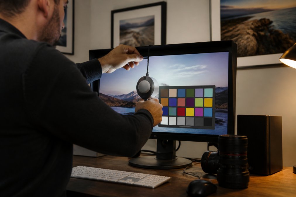
Monitor calibration for printing is the process of adjusting your display's brightness, color temperature, and gamma so it matches a known standard instead of your personal preference. Skip it, and you're editing against a moving target.
Brightness, Color Temperature, and White Balance
Factory monitors ship bright, often at 250-350 cd/m², because brightness sells on a showroom floor. Print evaluation wants something closer to 100-120 cd/m² in a dim room. Set white balance to D65 (6500K) and gamma to 2.2, then leave it alone.
Why Phone Screens Are Unreliable for Print Evaluation
Phone displays auto-adjust brightness based on ambient light, apply adaptive color shifting, and often run in a wide-gamut mode that exaggerates saturation. Since smartphones now capture the overwhelming majority of images, most people are judging print files on the least trustworthy screen in the house.
RGB vs CMYK Color Space: Why Your Printer Can't Reproduce Every Shade
RGB and CMYK are fundamentally different color models, and that difference explains most color shift complaints. RGB is additive: it builds color by adding light. CMYK is subtractive: it builds color by absorbing light with ink on paper. The two overlap, but not completely.
Gamut Limitations and Out-of-Gamut Colors
Gamut is the total range of colors a device can reproduce. Your monitor's gamut and your printer's gamut are different shapes, and any color outside the printer's shape has to be pulled back to the nearest printable equivalent. Vivid cyans, electric magentas, and certain saturated greens are the usual casualties.
| Issue | Cause | Practical Fix |
|---|---|---|
| Shadows look crushed | Screen brightness too high | Lower display to 100-120 cd/m² |
| Colors look dull | Out-of-gamut RGB values | Soft proof before ordering |
| Print looks too warm | Wrong white balance | Set monitor to D65 / 6500K |
| Saturation drops | CMYK gamut is narrower | Accept the shift or pick a different image |
| Texture looks flat | Screen can't show paper grain | Order a paper sample first |
Soft Proofing in Lightroom: Previewing the Print Before You Order
Soft proofing in Lightroom simulates how an image will look on a specific printer and paper combination before you spend money on it. You load the printer's ICC profile, and the software shows you the closest approximation of the final print on your calibrated screen.
The workflow is short:
- Open the Develop module and enable Soft Proofing
- Select the ICC profile matching your lab's printer and paper
- Turn on gamut warning to flag out-of-gamut colors
- Choose a rendering intent (perceptual for photos with wide color, relative colorimetric for accuracy)
- Adjust exposure and saturation to compensate
- Save a proof copy, never overwrite your master
Paper Stock, Texture, and Finish: The Variable Screens Can't Show
Paper is the variable no screen can display. A glossy stock pushes saturation and contrast. Matte absorbs light and softens both. Cotton rag adds visible texture that interacts with the image itself, and a fine art print on textured paper reads completely differently than the same file on smooth luster.
Ambient Lighting and Viewing Environment Standards
The room where you hang a print is part of the color management chain, and it's the link most guides ignore. A print viewed under warm 2700K bulbs will read warmer than the same print under daylight-balanced 5000K lighting. Neither is wrong, but if you don't know which light you're judging under, you can't tell whether a color shift came from the print or the room.
What Actually Matters in a Light Source
Three properties determine how a print reads in a given space:
- Correlated color temperature (CCT), measured in Kelvin. 2700K is warm and amber; 3000K is soft white; 4000K is neutral; 5000K-6500K approximates daylight. Most homes sit between 2700K and 3000K, which is warmer than the 5000K standard many labs use for proofing.
- Color rendering index (CRI), a 0-100 scale for how faithfully a light source renders color compared to a reference. A bulb with a CRI below 80 will make subtle color distinctions disappear. For evaluating fine art prints, look for CRI 90 or higher, and ideally R9 above 50 (R9 measures red rendering specifically, which most cheap LEDs handle poorly).
- Illuminance, measured in lux. Museum and gallery practice typically targets roughly 50-200 lux on the surface of a print, both to render color accurately and to limit fading. A typical living room at night with a single lamp may fall well below that; a south-facing window at midday can exceed it by an order of magnitude.
Practical Standards to Adopt
- View prints under the light they'll actually live in, not just your desk lamp. If the print is going above a fireplace lit by 2700K bulbs, judge it there.
- Keep bright, direct light off glossy surfaces. Glossy prints under a spotlight create specular hotspots that read as blown highlights.
- Avoid mixing warm and cool bulbs in the same room. Your eye adapts to the dominant source, and mixed lighting makes color judgment unreliable.
- Let your eyes adjust for at least 30 seconds before judging color. Chromatic adaptation is real and it takes time.
- If you're comparing two prints, view them side by side under the same source. Sequential viewing under different lights is not a valid comparison.
Why This Matters More Than Most Buyers Expect
A print that looks flat in a dim hallway can look rich and dimensional in a well-lit room, and vice versa. The ink and paper didn't change, the illuminant did. This is the same mechanism behind metamerism, where two colors that match under one light source diverge under another. Managing the viewing environment is the last, cheapest, and most overlooked step in getting a print to look the way you intended.
A Mobile-to-Print Workflow for Accurate Results
Most people shoot on a phone and order on a laptop, which means two uncalibrated screens and at least one lossy file conversion sit between the shutter press and the print. Competitors tend to skip this entirely, treating mobile capture as a footnote. It isn't, it's the dominant capture path, and it introduces specific failure points that desktop-only workflows never touch.
Why Phone Files Behave Differently
Modern phones capture in HEIC by default and tag images with the Display P3 color profile, which is wider than the sRGB space most consumer labs assume. If your lab's printer profile is built around sRGB and you hand them a P3-tagged file without conversion, saturated reds and greens get clipped or remapped unpredictably. The fix is not to shoot in sRGB on the phone, you'd lose tonal data, but to convert deliberately at export.
The Workflow
- Shoot in RAW or ProRAW if your phone supports it. RAW bypasses the phone's baked-in tone curve and preserves highlight and shadow headroom that HEIC throws away.
- Edit on the largest calibrated screen you own, not the phone. If you must edit on mobile, use an app that respects the embedded profile and disable any "auto-enhance" toggle.
- Export to a defined color space. For most consumer labs, export as sRGB at 300 ppi at the intended print dimensions. For a fine art lab that accepts Adobe RGB or ProPhoto RGB, export in the wider space and let their ICC profile handle the conversion.
- Check the histogram, not the preview. The histogram shows actual tonal distribution; the phone preview shows a bright, saturated, auto-adjusted version of it.
- Lower your display brightness to roughly half before judging shadows. Phone panels routinely run 600-1,000 nits outdoors; paper reflects a fraction of that.
- Transfer without re-compression. AirDrop, a direct cable, or a cloud service that preserves the original file. Messaging apps and social platforms re-compress and strip profiles.
- Soft proof with the lab's ICC profile if you're ordering a fine art print, and order a small test print first for any image you care about.
What to Ask Your Lab Before You Upload
- Which color space do you want the file in, sRGB, Adobe RGB, or ProPhoto RGB?
- Do you accept 16-bit TIFFs, or only 8-bit JPEGs?
- Will you apply your own sharpening and color correction, or print the file as delivered?
- What is the minimum resolution for the size I'm ordering?
A Two Sides study on print versus screen reading found that physical media and screens are consumed differently, and the same principle applies to how we evaluate images. The screen is a preview tool. The print is the artifact.
Conclusion
Getting a print that matches your screen comes down to accepting that the two mediums will never match exactly, then managing the gap with calibration, soft proofing, and the right paper. LarryCoulsonPhoto offers a curated collection of landscape, cityscape, nature, travel, and abstract fine art photography prints, each produced for museum-quality display in your home or office. Browse the collection and get started with LarryCoulsonPhoto to bring home wall art that holds up in person, not just on a screen.
Frequently Asked Questions
Why do my print colors not match my screen?
Screens emit light while paper reflects it, so the same image will always look different in each medium. Your monitor's brightness, color temperature, and uncalibrated display settings also shift how colors appear. Add the fact that printers use CMYK ink while screens use RGB light, and the mismatch becomes predictable. Calibrating your monitor and soft proofing before you order brings the two much closer, though a perfect match is physically impossible.
Do I need to calibrate my monitor for better print results?
Yes, if color accuracy matters to you. Monitor calibration for printing sets your display to a known standard for brightness, white balance, and color temperature. Without it, you are editing against an arbitrary baseline, and your prints will consistently come out darker or more saturated than expected. A hardware calibrator costs less than a single large print, and most photographers recalibrate every few weeks to account for display drift.
What is the difference between RGB and CMYK color modes?
RGB is an additive color model where red, green, and blue light combine to create colors on screens. CMYK is subtractive: cyan, magenta, yellow, and black inks absorb light on paper. RGB has a wider gamut, especially in bright greens and vivid oranges, so some screen colors simply cannot be reproduced in ink. Understanding RGB vs CMYK color space helps you anticipate which parts of an image will shift before you send it to print.
How do I make my prints more vibrant?
Start with soft proofing in Lightroom using your printer's ICC profile to see exactly which colors fall outside the printable gamut. Adjust saturation selectively rather than globally, and consider paper stock: glossy and metallic finishes hold more saturation than matte. Viewing environment matters too. A print under warm indoor lighting will look warmer than the same print under daylight.